
To optimize your ad layout for maximum click-through, focus on establishing a clear visual hierarchy with prominent headlines and strategic placement of key elements. Use contrasting colors to draw attention and guide viewers’ eyes naturally through the message, from the main offer to the call-to-action. Simplify the design with clean spacing and visual cues, ensuring quick understanding and engagement. Keep exploring these best practices to make your ads truly stand out and convert more viewers.
Key Takeaways
- Use a clear visual hierarchy by emphasizing headlines with larger fonts and strategic placement at the top.
- Incorporate contrasting colors to highlight key messages and create focal points that draw attention.
- Design a clean, simple layout guiding viewers naturally from main message to call-to-action.
- Utilize visual cues like arrows or lines and appropriate spacing to direct the viewer’s eye flow.
- Include emotionally appealing visuals and sensory cues to engage viewers and increase click-through rates.

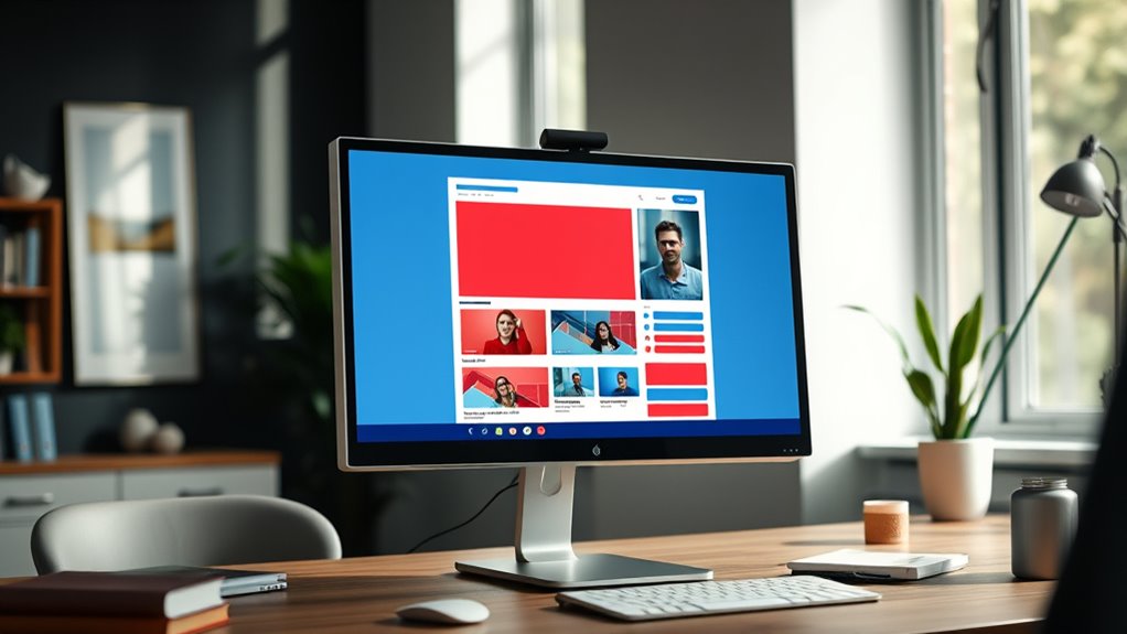
Have you ever wondered why some ads grab your attention instantly while others go unnoticed? The secret often lies in how the ad is designed, particularly through effective use of visual hierarchy and color contrast. When you’re creating an ad layout, your goal is to guide viewers’ eyes naturally to the most important elements, like your headline or call-to-action.
Visual hierarchy plays a pivotal role here; it involves arranging components so that viewers understand what to focus on first, second, and so on. You can achieve this by varying element sizes, positioning, and spacing. For example, making your headline larger and placing it at the top draws immediate attention. Subtle differences in font weight or style can also help emphasize key messages without overwhelming the viewer.
Arrange elements by size, position, and spacing to guide viewers’ focus naturally.
Color contrast is another essential factor that enhances visual hierarchy and makes your ad stand out. When you use contrasting colors—like a bright yellow button against a dark background—you create a focal point that naturally draws the eye. This contrast not only improves readability but also makes your call-to-action more compelling. Think about how red often signals urgency or importance; incorporating such bold colors strategically can influence viewer behavior.
Be mindful of maintaining harmony; overly clashing colors can distract or confuse viewers, so balance is key. Use contrast thoughtfully to highlight the most critical parts of your ad, ensuring they pop out and are easy to read at a glance.
Additionally, consider the overall flow of your ad. Your layout should lead the viewer’s eye smoothly from the most important message to supporting details and finally to the call-to-action. Use visual cues like arrows, lines, or spacing to guide this journey. Keep in mind that clutter reduces clarity, so prioritize simplicity.
A clean, well-organized layout with clear visual hierarchy and strong color contrast makes it easier for viewers to process information quickly. This reduces cognitive load and increases the likelihood they’ll engage with your ad.
Understanding how gelato flavors appeal to the senses can also influence your ad design by evoking emotions and drawing attention to featured products.
Frequently Asked Questions
How Do I Measure Ad Performance Effectively?
To measure ad performance effectively, focus on click-through metrics like CTR to see how well your ads engage viewers.
Use conversion tracking to monitor actions taken after clicks, such as purchases or sign-ups.
Regularly analyze these metrics to identify trends and optimize your ad layout.
Adjust your content and targeting based on data insights, ensuring your campaigns become more efficient and drive better results over time.
What Are Common Mistakes in Ad Layout Design?
You often make mistakes in ad layout design by neglecting visual hierarchy, which can confuse viewers and reduce engagement. Poor image placement might distract or hide key messages, lowering click-through rates.
To improve, make certain your most important elements stand out and are placed strategically, guiding viewers’ eyes naturally. Keep your layout clean and focused, avoiding clutter that overwhelms or distracts from your call-to-action.
Which Colors Boost Click-Through Rates?
Bright reds and vibrant oranges act like neon signs, grabbing attention and sparking urgency through color psychology. These hues can boost your click-through rates by creating a strong visual hierarchy that guides the eye directly to your call-to-action.
Keep in mind, contrasting colors also help your ad stand out amid clutter. By choosing these energetic shades, you turn your ad into a magnetic force that pulls clicks effortlessly.
How Often Should I Test New Ad Layouts?
You should test new ad layouts regularly, ideally every few weeks, to keep up with changing user preferences.
Use A/B testing to compare different designs and analyze user engagement metrics like click-through rates and time spent.
Consistent testing helps you identify what resonates best with your audience, ensuring your ads stay effective.
Don’t wait too long—frequent adjustments keep your campaigns fresh and optimized for better performance.
What Tools Assist in Ad Layout Optimization?
Think of tools like Google Optimize, Hotjar, and Canva as your guiding stars in the night sky. They help you refine your visual hierarchy and boost user engagement by testing different layouts, analyzing heatmaps, and creating eye-catching designs.
These tools illuminate what works best, allowing you to make data-driven decisions that enhance your ad’s effectiveness and attract clicks. With their help, your ad layout will always be on the right path.
Conclusion
Now that you know the key strategies for ad layout optimization, your next move could be the game-changer. Will you test bold new placements or refine your current design? Remember, small tweaks can release big results, but only if you’re willing to take that leap. The secret to boosting click-through rates lies just beyond your comfort zone. Are you ready to uncover what truly works? The next step could redefine your success—dare to find out.